August 5, 2013 From rOpenSci (https://deploy-preview-119--ropensci.netlify.app/blog/2013/08/05/noaa-sparklines/). Except where otherwise noted, content on this site is licensed under the CC-BY license.
We have started a new R package interacting with NOAA climate data called rnoaa. You can find our package in development here and documentation for NOAA web services here. It is still early days for this package, but we wanted to demo what you can do with the package.
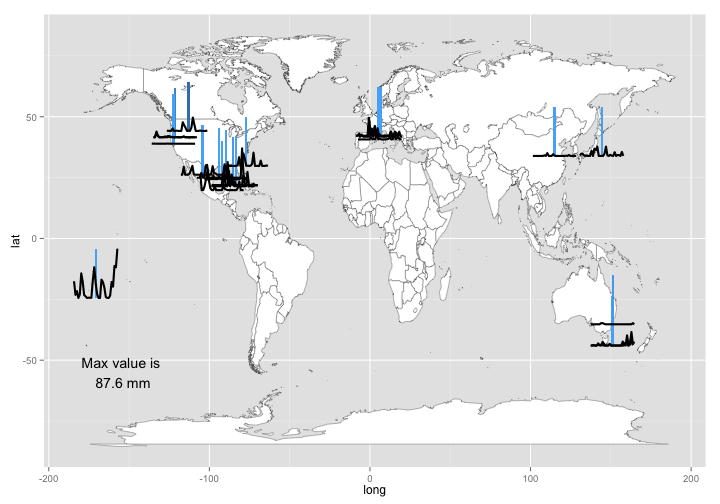
In this example, we search for stations that collect climate data, then get the data for those stations, pull out only the precipitation data, then get latitude/longitude coordinates for each station, and plot data on a map.
Load packages
library(rnoaa)
library(scales)
library(lubridate)
library(maptools)
library(ggplot2)
library(doMC)
library(ggsubplot)
library(maps)
library(plyr)
library(stringr)
Find stations to get data from
stations <- noaa_stations(dataset = "GHCND", enddate = "20121201")
res <- sapply(stations$data, function(x) x$meta$id)
Get data from stations, just searching on the first 60.
noaa_fw <- failwith(NULL, noaa)
registerDoMC(cores = 4)
dat <- compact(llply(as.character(res)[1:60], function(x) noaa_fw(dataset = "GHCND",
    station = x, year = 2010, month = 7), .parallel = TRUE))
Make a data.frame and fix dates.
df <- ldply(dat, function(x) x$data)
df$date <- ymd(str_replace(as.character(df$date), "T00:00:00\\.000", ""))
df <- df[df$dataType == "PRCP", ]
Get station lat and long data so that we can put data on a map.
latlongs <- llply(res[1:60], function(x) noaa_stations(x, dataset = "GHCND")$data$meta[c("id",
    "latitude", "longitude")])
latlongs <- ldply(latlongs, function(x) as.data.frame(x))
df2 <- merge(df, latlongs, by.x = "station", by.y = "id")
Here’s what the first six rows of data look like
head(df2)
            station       date dataType value  atts latitude longitude
1 GHCND:AQC00914000 2010-07-01     PRCP   297 01000   -14.32    -170.8
2 GHCND:AQC00914000 2010-07-02     PRCP    56 01000   -14.32    -170.8
3 GHCND:AQC00914000 2010-07-03     PRCP   122 01000   -14.32    -170.8
4 GHCND:AQC00914000 2010-07-04     PRCP     0 01000   -14.32    -170.8
5 GHCND:AQC00914000 2010-07-05     PRCP    61 01000   -14.32    -170.8
6 GHCND:AQC00914000 2010-07-06     PRCP   437 01000   -14.32    -170.8
Plot the data. Each sparkline on the map is the precipitation data for a station, where the values are tenths of mm of precipitation. The x-axis of each sparkline is number of days, where each line is the last 30 days of precipitation data. The blue line in each sparkline is the same y-axis for each line for reference. The station with the greatest value (87.6 mm) is the one in the ocean in American Somoa at (-14.31667,-170.7667).
world_map <- map_data("world")
p <- ggplot() + geom_polygon(data = world_map, aes(x = long, y = lat, group = group),
    fill = "white", color = "gray40", size = 0.2) + annotate(geom = "text",
    x = -155, y = -55, label = sprintf("Max value is\n %s mm", max(df2$value)/10))
p + geom_subplot(aes(longitude, latitude, group = station, subplot = geom_line(aes(date,
    value)), size = 1), ref = ref_vline(aes(fill = length(value)), thickness = 0.1),
    width = rel(2), height = rel(5), data = df2) + theme(legend.position = "none")

gistr map
There is a lot more to come in this package. Keep an eye on this blog and our twitter account (@ropensci).

